This project translates the history and material memory of Shaoxing Zhenyuan Tang into a contemporary package for wild ginseng.
This packaging design project was created for Zhejiang Zhenyuan, focusing on a wild ginseng product under Shaoxing Zhenyuan Tang, a time-honored Chinese medicine brand from Shaoxing, China. The work begins with the brand history, local context, store reputation, and the visual memory of traditional Chinese pharmacies.
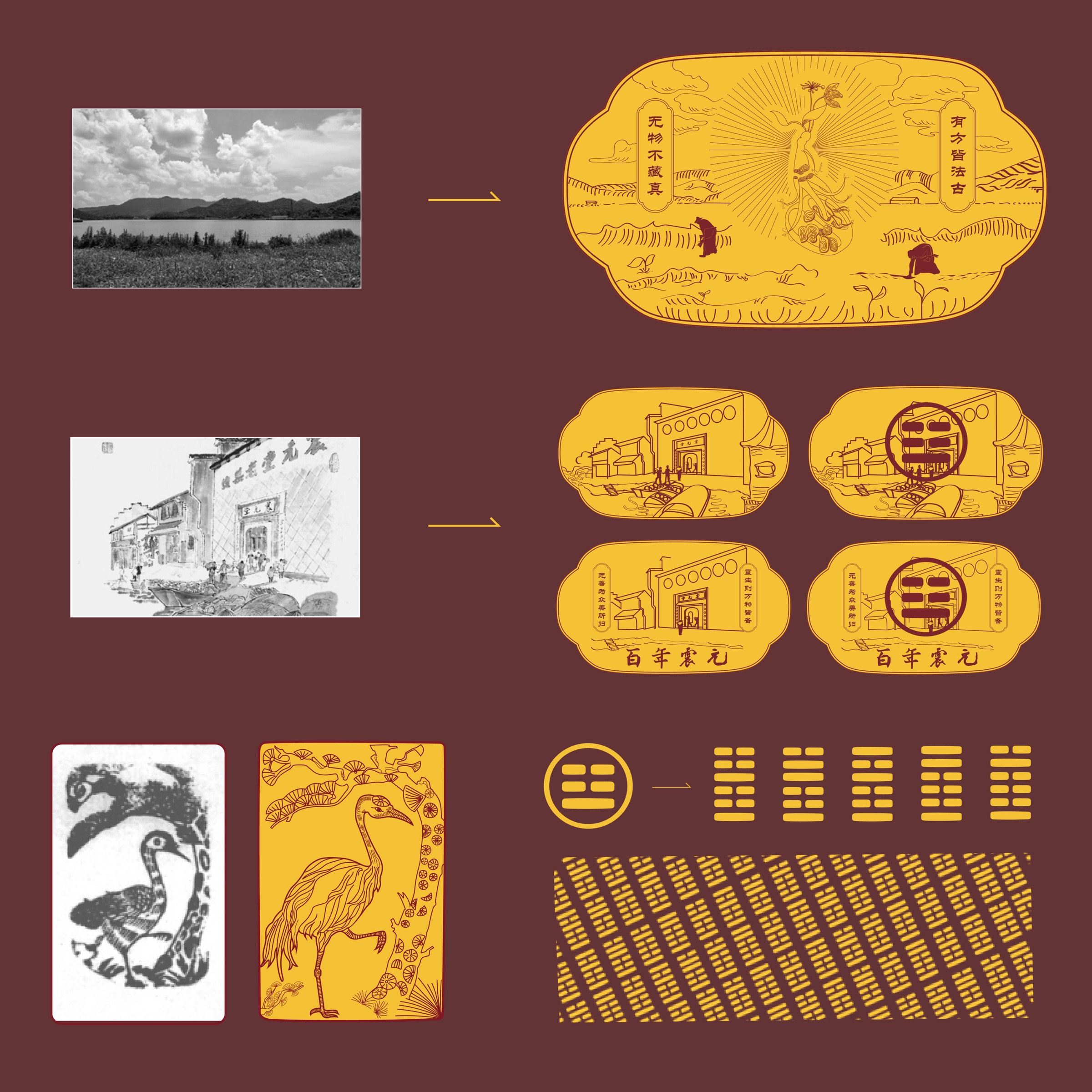
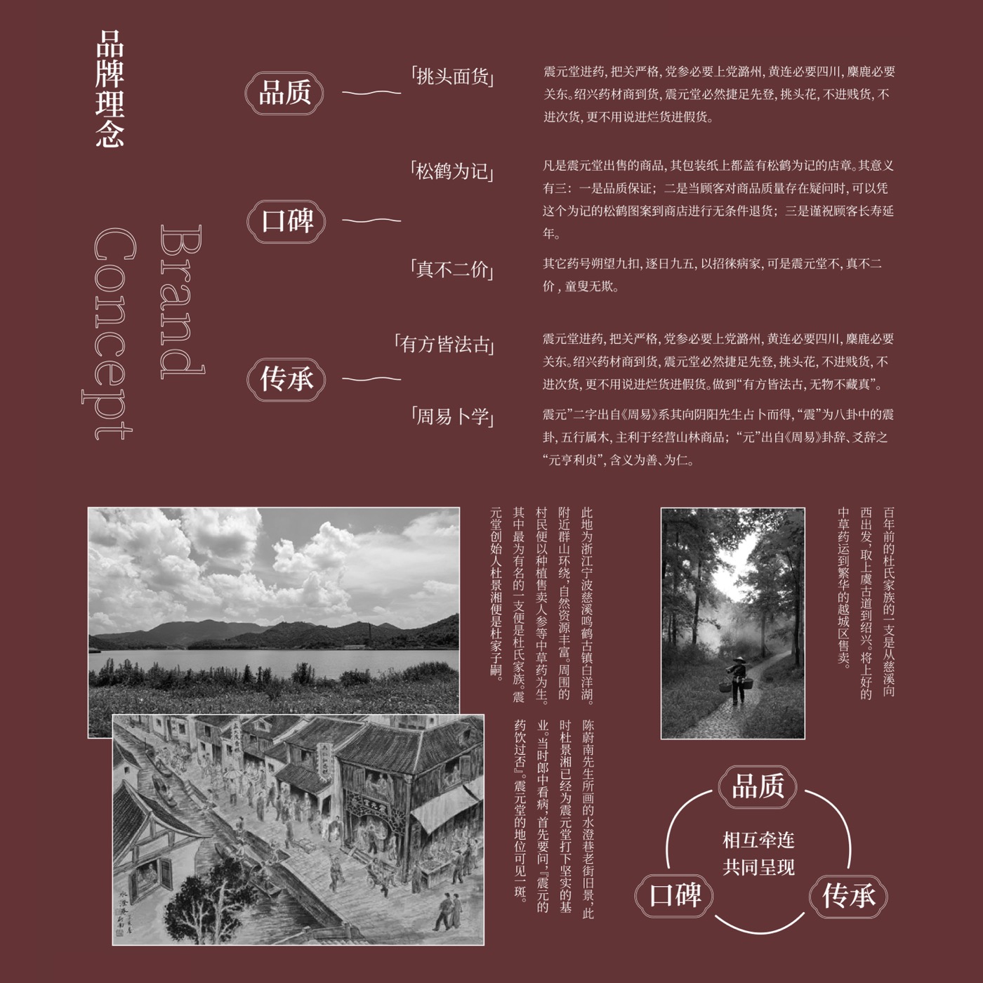
The concept is built around three ideas: quality, reputation, and inheritance. Historical phrases such as “strict selection of herbs,” “marked by pine and crane,” “fair and fixed pricing,” and “following ancient prescriptions” are treated as cultural clues for the visual system.
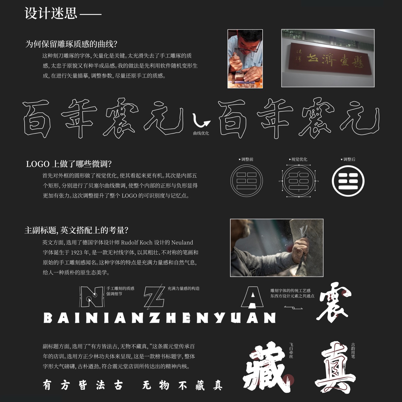
For the logo and lettering, the design keeps a carved, handmade texture rather than making the forms overly smooth. The Chinese title was vectorized and refined to retain the roughness of hand carving, while the logo was adjusted through subtle curve and proportion changes to improve recognition.
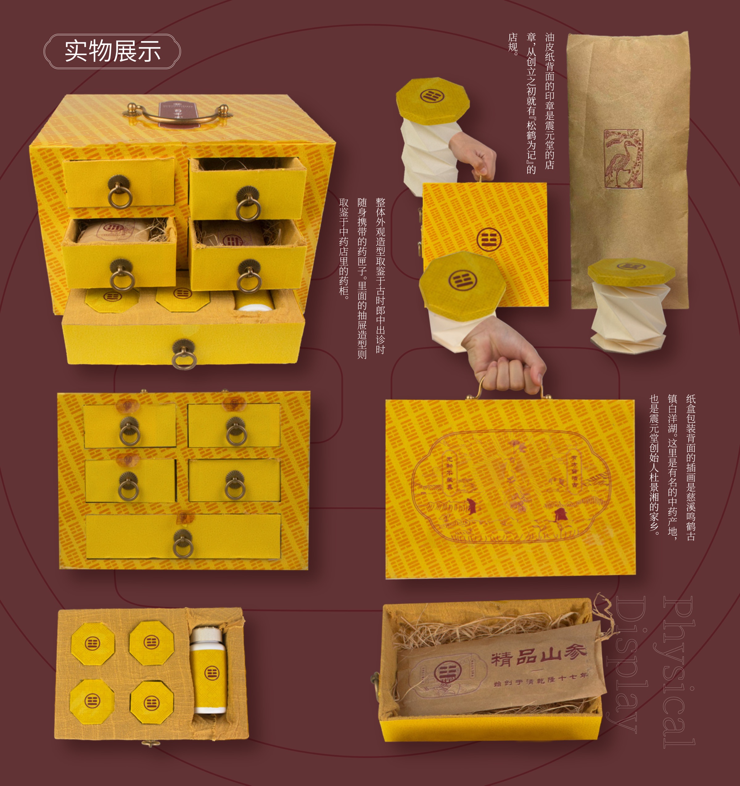
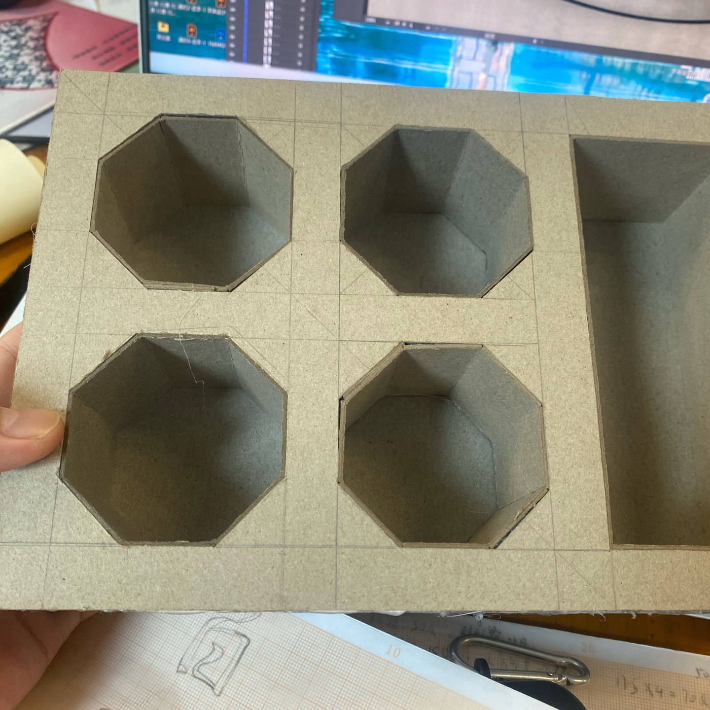
The package structure takes inspiration from old medicine cabinets and portable herbal medicine boxes. Drawers, handles, small inner packages, and paper wrapping turn the act of opening the wild ginseng package into a layered experience, echoing the storage and dispensing rituals of traditional pharmacies.
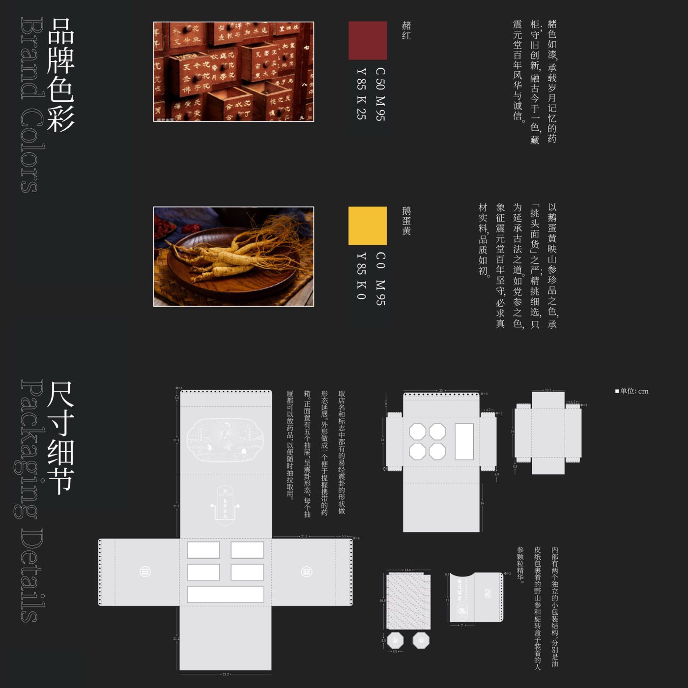
The color palette uses deep reddish brown and warm yellow tones, referencing old wooden medicine drawers, herbal materials, and the atmosphere of Chinese medicine shops. Illustration elements such as cranes, Baiyang Lake, old storefronts, and the “pine and crane” store mark extend the brand story across the package surface.